Football kit launches are always a moment of excitement for fans, but Manchester City’s 2025-26 third kit reveal has left the football world divided. The new design, which draws inspiration from Manchester’s famously unpredictable weather, has been described by some as a “rain-soaked washout” while others see it as a bold creative statement. At Jeetwin, we’ve taken a deep dive into the design, the inspiration behind it, and what this means for the club’s brand identity as they prepare for another season of intense competition.
The kit, unveiled at the Etihad Stadium during a rather fitting downpour, features a unique watercolor-like pattern that blends shades of grey, blue, and silver. According to the club, the design is meant to capture the essence of Manchester’s rainy streets reflecting the city lights at night, a nod to the industrial heritage and the relentless spirit of the city. But does the execution match the vision? Let’s break it down.
The Design Inspiration: A City Under Water
Who Was Behind the Concept?
Puma, City’s kit manufacturer, collaborated with local artists to create a design that feels authentically Mancunian. The concept is deeply personal to the club’s identity, moving away from the more traditional blue and sky-blue palettes seen in previous seasons. The 2025-26 third kit is intended to be a celebration of the city’s resilience, with the “rain-soaked” aesthetic symbolizing how Manchester thrives even in the gloom.
The Visual Breakdown
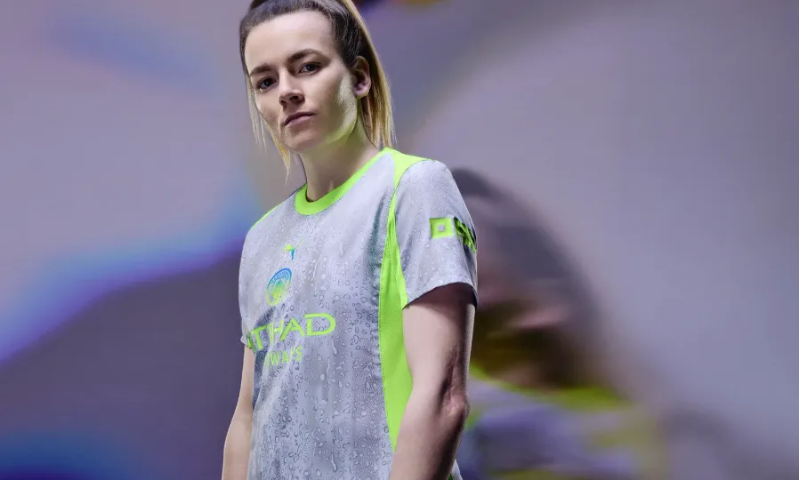
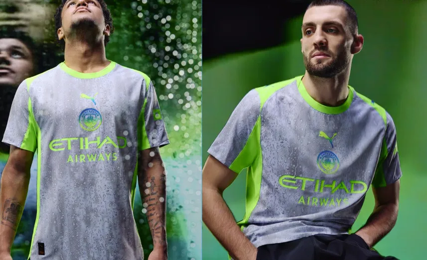
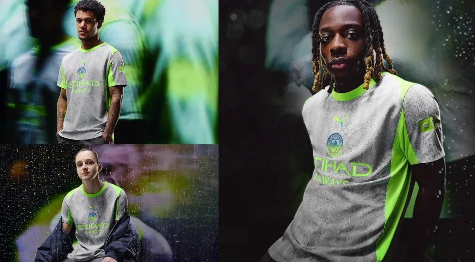
The kit’s base color is a muted silver-grey, but it’s the all-over print that steals the show. Large, blurred patches of dark blue and charcoal grey create a chaotic yet coherent pattern, almost like a watercolor painting left out in the rain. The club crest, Puma logo, and sponsor text are rendered in a clean white to stand out against the busy background. Shorts and socks follow the same theme, with the shorts featuring a similar washed-out pattern and the socks keeping it simple with solid charcoal.
Fans attending the launch event were given a firsthand look, and early reactions were mixed. One season ticket holder commented to Jeetwin that the design “looks like a mistake from a printing press,” while another praised it as “the most creative kit City has produced in years.”
Reception: A Divided Fanbase
The Criticism
Social media has been ablaze with memes comparing the kit to a “wet pavement” or a “forgotten watercolor project.” Some fans feel the design is too far removed from City’s traditional aesthetic, arguing that a third kit should still maintain a clear connection to the club’s iconic sky blue. The comparison to a “washout” is apt for those who prefer cleaner, simpler designs. There’s also concern that the pattern might look muddy on the pitch, particularly under stadium lights or in televised matches, potentially making it harder to distinguish players at a distance.
The Praise
On the flip side, many fans and fashion enthusiasts are celebrating the bold departure. Football kit design has become a major part of modern sports culture, and clubs are increasingly pushed to create unique, collectible pieces. The 2025-26 third kit is undeniably memorable, and for a generation of fans who value individuality, that’s a huge plus.
“Finally, a kit that doesn’t look like every other template,” another fan wrote. “This is art. It’s a conversation starter, and it’s perfectly Manchester.”
Performance and Practicality: More Than Just a Look
On the Pitch
While the design is visually polarizing, the kit’s performance features are top-notch. Puma’s Ultraweave fabric, used in the kit, is designed for maximum breathability and moisture-wicking, which is crucial for players during high-intensity matches. The rain-soaked theme is actually quite appropriate for Manchester’s climate, where matches often take place in wet conditions. However, there’s a humorous irony: the kit is designed to look wet, even when it’s dry.
Expert kit analyst John Harrison, a long-time contributor to sportswear reviews, shared his thoughts with Jeetwin: “The performance specs are standard for Puma’s top-tier line. The moisture management is excellent, and the cut is modern and athletic. The only question is whether the pattern has any effect on player visibility during fast-paced play, but that’s more of a psychological factor than a practical one.”
Durability Concerns
Some fans have raised concerns about the print fading after multiple washes, a common issue with complex, all-over patterns. Puma has assured that the sublimation printing process used ensures long-lasting color retention, but only time will tell. Early unboxing videos from kit reviewers show a sturdy finish, but real-world testing will be necessary.
The Marketing Campaign: A Weather-Themed Rollout
To accompany the launch, Manchester City released a short film featuring first-team players like Erling Haaland and Phil Foden navigating a dramatic, rain-soaked Manchester. The campaign highlights the city’s architecture, from the Victorian mills to the modern skyline, all blurred through sheets of rain. It’s a poetic tribute to the club’s roots, and the cinematography has been widely praised, even by those who aren’t fond of the kit itself.
The marketing has successfully generated buzz, which is half the battle for any new product. Whether that buzz translates to strong retail sales remains to be seen.
Expert Analysis: What This Means for City’s Brand
A Shift Toward Artistic Expression
“Manchester City has evolved from being just a football club into a global lifestyle brand,” explains sports marketing expert Dr. Sarah Collins. “This kit is a reflection of that shift. They are no longer just selling merchandise to match-going fans; they are selling a piece of identity and culture. The risk is alienating the traditional fanbase, but the reward is capturing a younger, trendier audience.”
The 2025-26 third kit fits into a broader trend of clubs experimenting with “fashion-forward” designs. Similar bold releases from other top clubs have proven divisive but commercially successful. For example, Inter Milan’s “Snake” kit and Barcelona’s abstract designs have all found their niche markets.
Comparison to Previous City Kits
This isn’t the first time City has taken a risk. The 2014-15 season’s camouflage third kit and the 2021-22 season’s neon green outfit were also met with mixed reactions. However, this latest design feels more conceptual and less connected to the club’s visual history.
Conclusion: The Final Verdict on Manchester City’s 2025-26 Third Kit
Manchester City’s new rain-soaked 2025-26 third kit is undeniably a conversation starter. It’s a bold, artistic interpretation of the club’s identity that will likely look better on fans in the stands than it does in product shots. The inspiration is authentic, the storytelling is compelling, and the performance quality is professional-grade. However, its divisive nature means it won’t please everyone.
For those who appreciate football kits as a form of self-expression, this is a must-have. For purists who prefer tradition, it may be one season to sit out. Either way, the kit has achieved its goal: it has made Manchester City a talking point, even before a ball is kicked.
Do you love it or hate it? Share your thoughts in the comments below, and let us know if you’ll be picking one up for the new season. For more in-depth analysis of the latest football kits and trends, stay tuned to Jeetwin.